 Fixated on Home
Introduction to 2026 Bedroom Color Trends
Selecting the right color scheme is essential for any modern bedroom renovation project in 2026. Homeowners increasingly prioritize palettes that deliver both visual appeal and functional benefits, such as improved sleep quality and enhanced property value. This comprehensive guide delves into trending color options, offering detailed explanations, real-world examples, and actionable advice tailored to contemporary renovation needs. By focusing on calming yet stylish combinations, readers can transform outdated spaces into serene retreats that align with current design standards.
The demand for thoughtful color application stems from broader shifts toward wellness-oriented interiors. In 2026, successful renovations integrate color psychology with practical considerations like material durability and lighting conditions. Whether updating a primary suite or a guest room, understanding these elements ensures long-lasting results that feel both modern and timeless.
The Role of Color Psychology in Bedroom Design
Color psychology forms the foundation of effective bedroom schemes, influencing emotions and daily routines. Soft blues evoke calmness by reducing stress levels, while earthy greens foster a connection to nature that aids relaxation. Muted neutrals provide a versatile backdrop that adapts to changing decor trends without overwhelming the senses. In contrast, overly vibrant shades may disrupt rest, making subtle variations preferable for sleep-focused spaces.
Practical application involves testing how colors respond to personal preferences and room orientation. For instance, individuals seeking mental clarity often gravitate toward cool undertones that promote focus during morning routines. This approach not only enhances comfort but also supports mental well-being in high-use areas like bedrooms. Expanded research highlights connections between hue selection and occupant satisfaction over extended periods.
Comparing Warm Versus Cool Tones for Modern Spaces
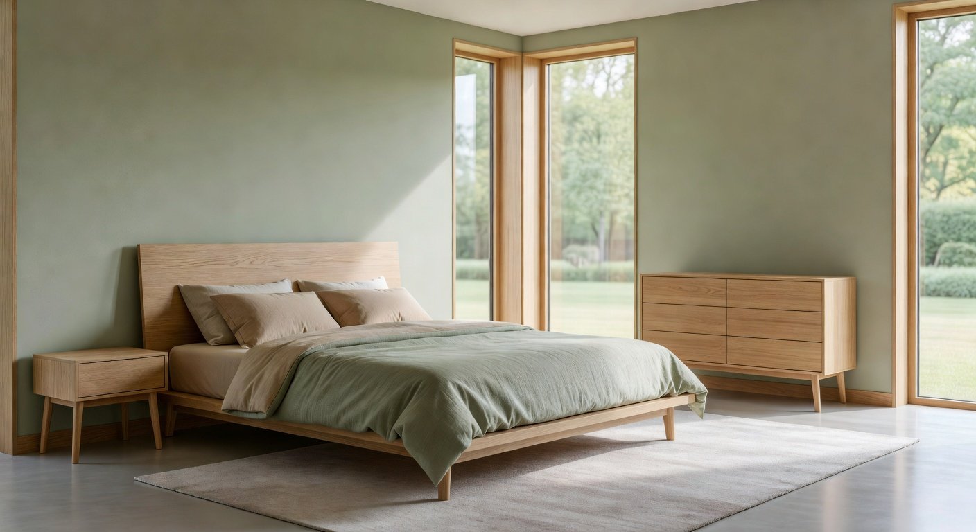
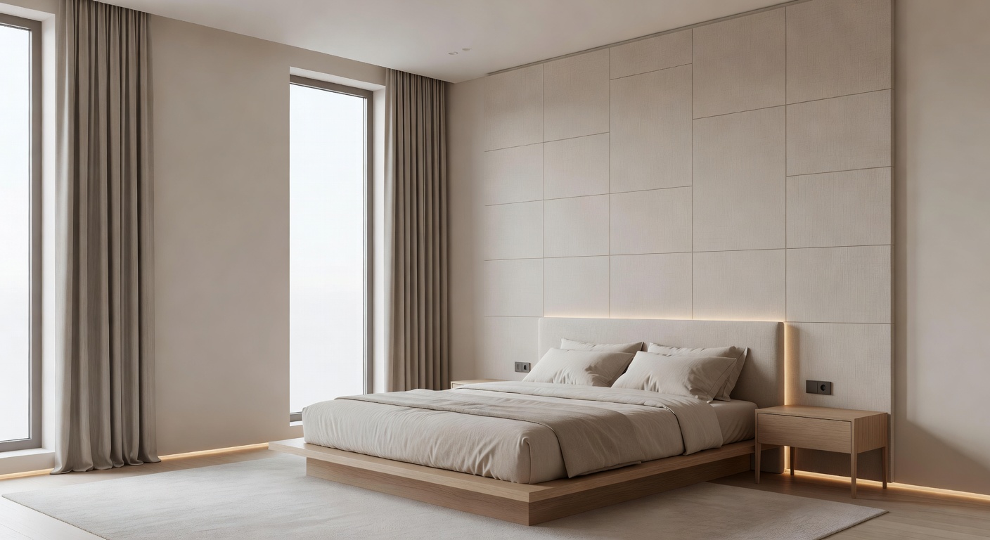
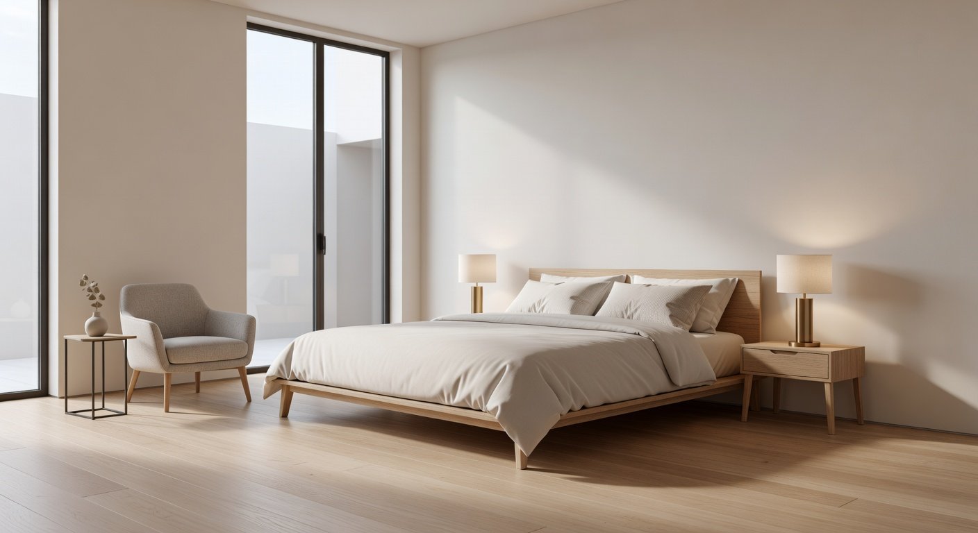
Warm tones such as terracotta, dusty rose, and soft beige create intimate atmospheres suited to compact bedrooms or those with minimal natural light. These hues add depth when layered with textured elements like wool rugs or linen bedding. Cool tones including sage, slate blue, and soft lavender visually enlarge rooms and excel in spaces flooded with sunlight, offering a fresh, airy quality.
Direct comparisons reveal distinct outcomes: warm palettes tend to make spaces feel cozier and more inviting for evening wind-downs, whereas cool options support productivity in home offices doubling as bedrooms. Hybrid strategies often yield the best results, combining a warm base wall with cool accent pieces for balanced energy. Real renovation projects demonstrate how switching from stark whites to these nuanced tones revitalizes entire layouts.
- Warm tones: Ideal for adding warmth to minimalist designs with wood or rattan furniture.
- Cool tones: Perfect for maximizing light reflection in urban apartments.
- Hybrid approaches: Use warm neutrals on three walls and a cool feature wall behind the bed.
Step-by-Step Process for Selecting Color Schemes
A methodical selection process prevents common pitfalls and ensures cohesive results. Begin by evaluating fixed elements including flooring materials, window treatments, and architectural features. Next, obtain physical paint samples and observe them across morning, afternoon, and evening lighting to account for shifts in appearance.
Subsequent steps include cross-referencing with sustainable material catalogs and mapping furniture placement on scaled room diagrams. Finalize decisions by simulating full schemes through digital visualization tools or temporary swatches. This thorough process typically spans several weeks but dramatically reduces revision needs during active renovation phases.
- Inventory all permanent room features and measure square footage.
- Research 2026 trend reports for emerging shades and undertones.
- Apply test patches in 2x2 foot sections on multiple walls.
- Consult color wheels to identify complementary or analogous pairings.
- Review outcomes with household members for consensus.
Pairing Colors with Sustainable Materials
Integrating eco-conscious materials elevates color schemes beyond aesthetics. Reclaimed timber headboards complement warm terracotta walls, while organic cotton drapes soften cool sage environments. Bamboo flooring pairs naturally with neutral bases, providing durability and reduced environmental impact. These pairings contribute to healthier living spaces by minimizing chemical off-gassing.
Additional options include recycled metal accents in matte finishes that enhance both warm and cool palettes. The EPA offers guidance on low-impact building materials. Similarly, energy-efficient insulation hidden behind painted surfaces supports overall sustainability goals. Explore energy-saving renovation strategies from the U.S. Department of Energy. Such integrations ensure bedrooms remain stylish while meeting modern environmental standards.
Coordinating Schemes with Existing Furniture
Effective coordination begins with identifying dominant furniture colors and finishes. Neutral wall palettes allow statement pieces like upholstered beds or wooden dressers to take center stage. For mismatched items, introduce transitional shades that bridge styles, such as greige tones blending gray and beige.
Practical examples include refreshing a mid-century modern set with cool blue walls that highlight teak grains, or updating traditional pieces via warm beige backdrops that soften ornate details. Layering accessories in complementary hues completes the look without requiring new purchases. This strategy preserves budget while achieving polished, intentional designs.
Practical Examples of Transformations
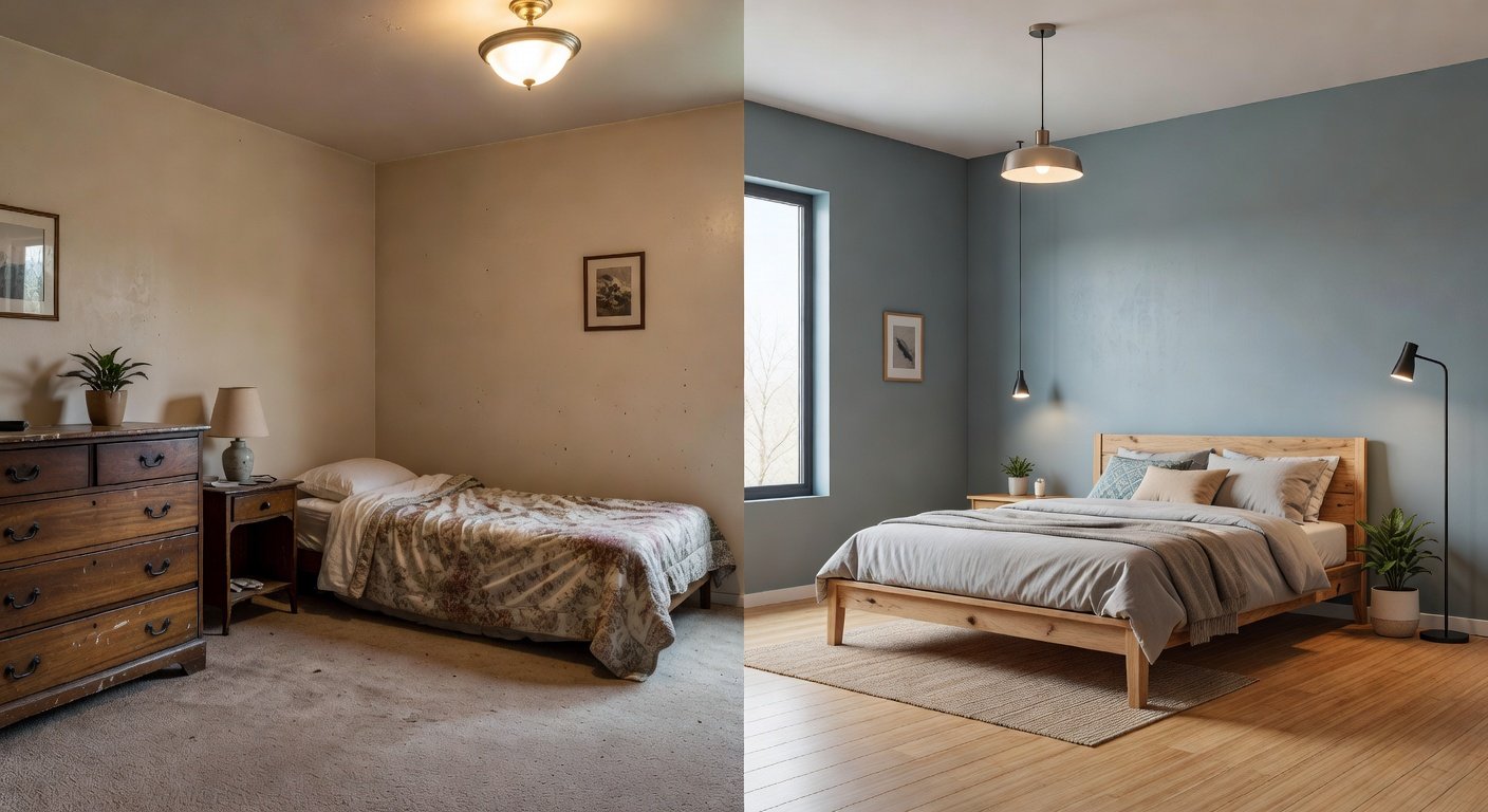
One notable transformation involved converting a cramped, dark bedroom into an expansive-feeling sanctuary using cool lavender walls paired with white oak furniture and sheer curtains. The before state featured heavy brown paneling that absorbed light; the after version reflected illumination throughout, increasing perceived size by nearly a third.
Another project updated a dated guest room with warm terracotta accents on a single feature wall against soft gray surroundings. Existing metal bed frames were refinished in complementary tones, resulting in a cohesive space that felt both contemporary and welcoming. These cases illustrate measurable improvements in ambiance and functionality post-renovation.
Common Mistakes to Avoid
Many renovations falter due to overlooking lighting interactions or selecting trendy shades without testing longevity. Avoid rushing sample applications or ignoring undertones that clash with flooring. Another frequent error involves neglecting future adaptability, such as choosing highly saturated colors unlikely to age gracefully.
Instead, prioritize timeless foundations with seasonal accents through textiles. Documenting each decision with photos aids in maintaining consistency across phases of the project.
FAQs on Maintenance, Lighting, and Budget Options
How do I maintain painted surfaces? Regular dusting with microfiber cloths and occasional wiping with mild soap solutions preserves finish integrity. Schedule professional touch-ups every two years for high-traffic zones.
How does lighting affect colors? Natural daylight reveals true hues, while artificial sources like warm LEDs enhance cozy warm tones and cool LEDs intensify fresh palettes. Test combinations under multiple bulb types before committing.
What budget-friendly paint options exist? Quality mid-tier paints with good coverage and low volatile organic compounds deliver reliable performance without premium costs.
Can I mix warm and cool tones? Absolutely, through strategic placement of rugs, pillows, and artwork that bridge temperature differences for dynamic yet harmonious results.
By applying these insights, 2026 bedroom renovations achieve both aesthetic excellence and practical value enhancement.
No comments yet. Be the first!