 Fixated on Home
2026 Kitchen Color Palettes for Modern Home Upgrades
Kitchen renovations represent one of the most impactful ways homeowners can enhance both the visual appeal and daily functionality of their living spaces. As we move into 2026, color selection in kitchen design has evolved to emphasize balanced, enduring palettes that integrate seamlessly with modern aesthetics while addressing practical concerns such as lighting efficiency, maintenance ease, and spatial perception. This comprehensive guide delves into the most influential 2026 kitchen color palettes, explores the psychological effects of these choices, examines effective material pairings, and provides detailed step-by-step guidance for successful implementation in real-world renovations.
Trending 2026 Kitchen Color Palettes
Leading interior designers and renovation experts are prioritizing palettes that blend soft neutrals with organic earth tones and carefully restrained accent colors. These schemes create a sense of spaciousness in compact kitchens while adding inviting warmth to larger open-concept layouts. The focus remains on longevity rather than short-lived trends, ensuring the color choices continue to feel fresh years after installation.
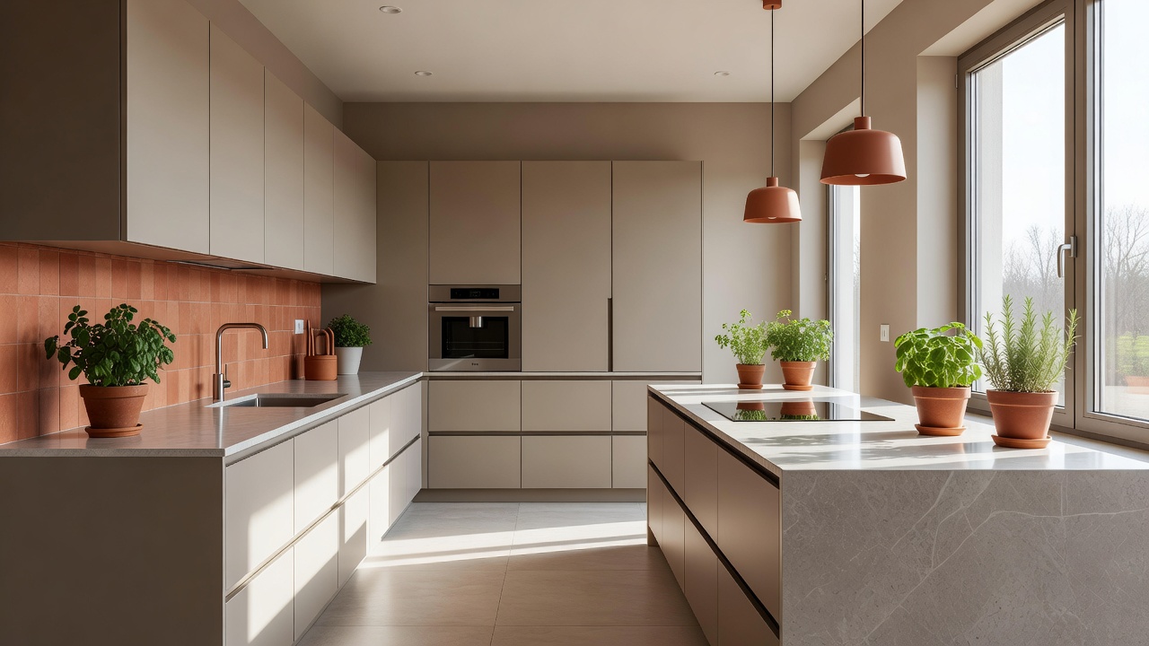
1. Warm Greige with Terracotta Accents
This palette centers on versatile greige tones that sit between gray and beige, providing a sophisticated neutral base. When paired with terracotta elements in backsplashes or decorative tiles and finished with brushed brass hardware, the result is a grounded, welcoming environment. Homeowners appreciate how this combination adapts to both minimalist and transitional styles without requiring frequent updates.
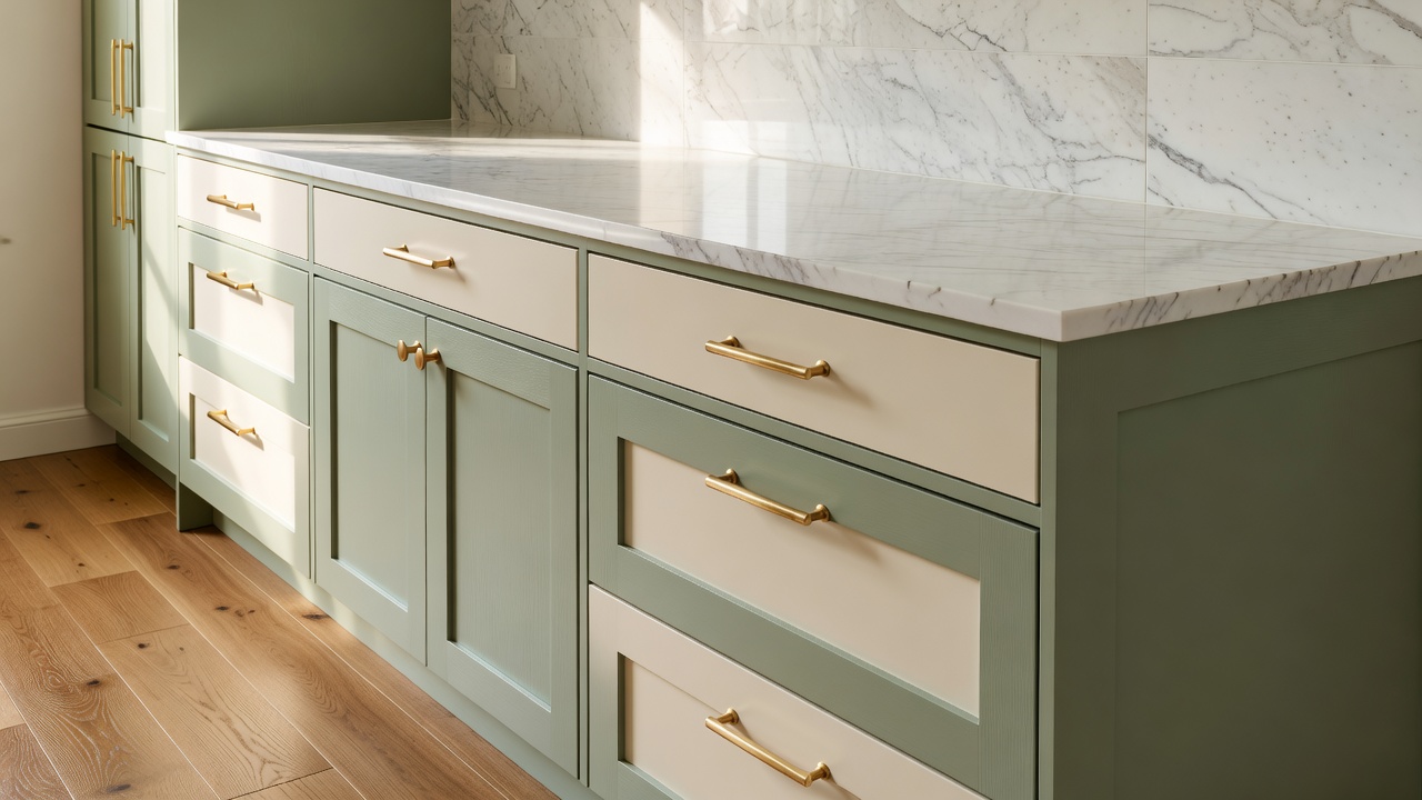
2. Sage Green and Cream
Muted sage green cabinetry offers a soft, nature-inspired depth that contrasts beautifully with creamy off-white walls and durable quartz countertops. This pairing fosters a calm atmosphere ideal for busy households while maintaining a clean, contemporary appearance that photographs well in real estate listings.
3. Charcoal and Warm White
Deep charcoal used on islands or feature walls against warm white perimeter cabinetry creates strong visual definition. This high-contrast approach helps delineate functional zones within open kitchens and introduces architectural interest that elevates the overall design.
The Psychology of Kitchen Colors
Color choices in kitchens directly influence occupant mood, appetite, and perceived room size. Warm neutrals tend to stimulate conversation and create an appetite-friendly environment, whereas cooler sage greens can reduce visual fatigue during extended meal preparation. Research into environmental psychology demonstrates that thoughtfully balanced palettes contribute to lower stress levels in high-traffic areas. To achieve optimal results, homeowners should apply large paint samples to multiple walls and observe how both natural daylight and evening artificial lighting alter the appearance throughout the day and across seasons.
Pairing Colors with Materials
Effective color schemes require careful coordination between cabinet finishes, countertops, flooring, and hardware. Matte black fixtures pair elegantly with charcoal tones, while natural oak or engineered wood flooring introduces organic texture that softens greige or sage walls. Selecting quartz or porcelain surfaces with matching undertones prevents undesirable clashes under different lighting conditions. For deeper guidance on material coordination and professional case studies, refer to established resources at Architectural Digest and This Old House.
Step-by-Step Application Tips
Following a structured process helps ensure color decisions translate successfully into the finished renovation. Begin by evaluating existing lighting conditions and accurately measuring all wall and cabinet surfaces. Next, order large-format paint samples and live with them for several days under real usage patterns. Apply the base color to the largest surfaces first, such as walls or full cabinet runs, before introducing accent shades through backsplashes, open shelving, or island fronts. Finally, install all hardware, lighting fixtures, and accessories before making final judgments on the overall harmony.
Before-and-After Comparisons
Consider a mid-century suburban kitchen originally finished in dark oak cabinetry. After repainting lower cabinets in sage green and upper cabinets in warm cream while updating the backsplash to subtle marble, the space gained significant brightness and modern depth without altering the footprint. In another project, stark white walls were replaced with warm greige throughout, complemented by terracotta tile accents. The renovation created a more cohesive visual flow into the adjoining dining area and improved the perceived value of the home.
Real-Home Examples
One suburban family renovated their 250-square-foot kitchen using the charcoal and warm white palette to clearly separate a breakfast nook from the main cooking zone. The defined areas improved traffic patterns during morning routines. In an urban apartment setting, sage green and cream tones were selected to maximize the impact of limited natural light, resulting in a brighter, more expansive feel despite the compact layout.
Lighting Considerations for Color Success
Lighting plays a decisive role in how any palette performs. Layered lighting that combines under-cabinet LEDs, pendant fixtures, and recessed ceiling lights allows colors to shift appropriately from daytime tasks to evening ambiance. Homeowners should also account for window orientation when selecting undertones, as north-facing rooms benefit from warmer greiges while south-facing spaces can handle cooler sages.
Common Mistakes to Avoid
- Selecting colors without testing them under the kitchen’s actual lighting conditions at multiple times of day.
- Ignoring subtle undertones that create clashes between cabinetry, countertops, and backsplashes.
- Overusing high-contrast accent colors that may feel dated within a few years.
- Neglecting the durability and cleanability of chosen finishes in heavily used areas near sinks and cooktops.
- Failing to consider how the palette will interact with existing furniture and accessories brought from other rooms.
Frequently Asked Questions
How do I decide among several appealing 2026 palettes?
Evaluate your kitchen’s square footage, amount of natural light, and existing architectural details. Create physical mood boards with actual material samples and live with them for at least a week before committing.
Can these palettes be adapted for rental properties?
Yes. Focus on removable elements such as peel-and-stick backsplash tiles, freestanding islands painted in accent colors, area rugs, and decorative accessories that introduce the palette without permanent alterations.
What approach works best when natural light is limited?
Choose lighter greige or cream base colors and incorporate reflective surfaces including polished hardware, glossy tile, or light-colored quartz to help bounce available light throughout the space.
How long should I expect these color choices to remain current?
Well-balanced palettes built around neutrals and soft earth tones typically maintain relevance for seven to ten years when executed with quality materials and timeless hardware selections.
Conclusion
Thoughtful selection of 2026 kitchen color palettes can transform a renovation into a lasting upgrade that enhances both aesthetics and functionality. By understanding color psychology, rigorously testing material combinations, and following methodical application steps, homeowners achieve modern results that stand the test of time. Additional professional remodeling insights are available through trusted sources such as Houzz.
No comments yet. Be the first!