 Fixated on Home
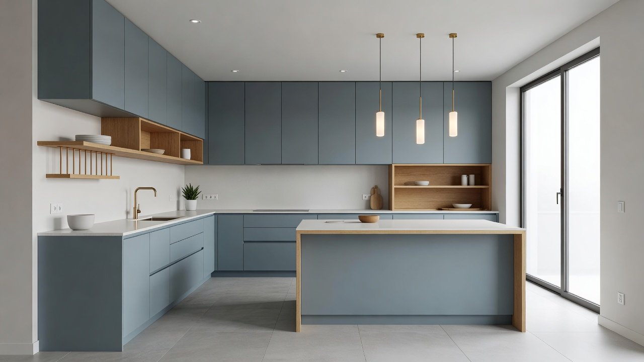
Introduction to Color Psychology in Modern Kitchens
Color psychology examines how hues influence emotions, behavior, and perceptions, making it essential for kitchen renovations in contemporary homes. Homeowners increasingly seek spaces that balance energy for daily tasks with calm for relaxation. This guide provides actionable remodeling advice based on established principles to help you choose colors that complement existing design elements while boosting functionality. By understanding these effects, you can create a kitchen that not only looks modern but also supports your household's emotional and practical needs throughout the day.
Understanding the Basics of Color Psychology
Colors trigger psychological responses rooted in cultural associations and biological reactions. Red can stimulate appetite and conversation, while blues promote tranquility. In kitchens, where people gather and prepare meals, selecting the right palette supports both productivity and emotional well-being. Research from sources like Psychology Today highlights how environmental colors affect stress levels and decision-making during meal preparation. Further studies indicate that warm colors encourage social interaction, whereas cooler shades help maintain focus during repetitive tasks like chopping or cleaning. These responses vary slightly by individual but follow predictable patterns across populations, allowing designers to apply them reliably in renovations.
Recommended Palettes for Energy and Calm
For energetic kitchens suited to active families, consider vibrant yellows paired with crisp whites to foster creativity and alertness. Calm-focused designs often feature soft greens and muted grays that evoke nature and serenity. These palettes integrate seamlessly with modern elements like quartz countertops and stainless steel appliances. 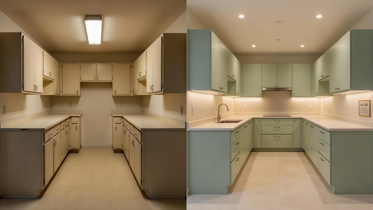
Warm Versus Cool Tones: A Detailed Comparison
Warm tones such as terracotta and soft oranges create inviting atmospheres ideal for entertaining, but they may make small spaces feel cozier yet more enclosed. Cool tones including sage green and sky blue expand visual space and reduce visual fatigue during long cooking sessions. Modern renovations benefit from hybrid approaches where warm accents appear on islands and cool shades dominate walls. Homeowners report improved daily satisfaction when balancing these effects based on room orientation and natural light exposure. Warm tones tend to energize social gatherings, while cool tones support methodical work; comparing them helps tailor the design to your specific lifestyle patterns.
Practical Steps for Selecting Hues That Complement Your Home
Begin by assessing your existing color scheme from adjacent rooms to ensure flow. Next, evaluate natural light patterns throughout the day. Use digital visualization tools or physical swatches to preview combinations. Consider undertones carefully—some whites lean yellow while others appear blue. Test samples on multiple surfaces including cabinets, walls, and backsplashes before committing. Finally, align choices with lifestyle needs, such as high-energy cooking zones versus quiet breakfast nooks. This systematic approach prevents costly mistakes and ensures the final result feels cohesive with the rest of your modern home.
Step-by-Step Color Selection Process
- Inventory current finishes and materials in your home.
- Identify primary mood goals: energizing or soothing.
- Review manufacturer color collections for modern kitchen trends.
- Apply test patches and observe under varied lighting.
- Consult with a designer for professional validation.
- Finalize selections after living with samples for several days.
Real-World Before-and-After Transformation Examples
One suburban home transformed a dated brown kitchen into an airy space using cool gray-blues on cabinets and warm wood accents on open shelving. The family noted increased time spent cooking together after the update. Another urban loft shifted from stark white to a balanced palette of warm neutrals with teal highlights, resulting in a more welcoming environment for guests. A third example involved a compact city apartment where deep forest greens were introduced on lower cabinets to promote calm during busy mornings, paired with lighter upper cabinets for an open feel. These changes demonstrate how thoughtful color application elevates both aesthetics and daily experience across different home types.
Tips for Testing Colors Before Full Commitment
Always paint large sample boards rather than tiny patches to see true impact. Observe samples at different times of day and under artificial lighting. Involve household members in the decision to account for varied preferences. Avoid rushing—live with samples for at least a week to ensure the colors remain appealing over time. Additionally, photograph the samples in your actual kitchen to review them objectively and compare against your existing furniture and flooring.
Addressing Lighting Impacts on Kitchen Colors
Lighting dramatically alters color appearance. Natural daylight reveals true hues, while warm LED bulbs can shift cool tones toward yellow. Install layered lighting including under-cabinet fixtures and dimmable overheads to maintain consistency. Modern smart lighting systems allow adjustments that preserve intended psychological effects throughout the evening. Understanding these interactions ensures your chosen palette performs as expected regardless of time or season, drawing on insights from resources such as Verywell Mind.
Ensuring Longevity of Your Color Choices
Neutral bases with strategic accent colors offer flexibility for future updates without full repaints. High-quality paints with low-VOC formulas resist fading and maintain vibrancy. Trends evolve, so timeless palettes grounded in personal comfort outperform fleeting fads. Regular maintenance keeps surfaces looking fresh for years. Consider how colors age with use, such as choosing slightly darker shades on high-touch areas to hide minor wear.
Common Mistakes to Avoid in Kitchen Color Selection
Many homeowners overlook how colors interact with their specific lighting conditions, leading to disappointing results after installation. Another frequent error is ignoring the kitchen's primary use patterns, such as selecting overly stimulating hues for a space meant for quiet morning routines. Failing to coordinate with adjacent rooms can also disrupt the overall home flow. By anticipating these pitfalls through careful planning, you can achieve a renovation that remains satisfying long after completion.
Frequently Asked Questions
How does lighting affect color perception in kitchens?
Artificial lights can warm or cool perceived tones, so testing under multiple conditions prevents surprises after installation.
Are certain colors more durable for high-use kitchen areas?
Yes, mid-tone colors hide wear better than pure whites or deep blacks, extending the visual lifespan of your renovation.
Can I mix warm and cool tones successfully?
Absolutely—strategic mixing creates dynamic yet balanced spaces when guided by overall home harmony.
What role does color play in small kitchen functionality?
Lighter cool tones can make compact kitchens feel larger and more efficient for movement during meal prep.
Conclusion
Applying color psychology principles transforms kitchen renovations into personalized, functional environments. By following the outlined steps and considering real examples, you can achieve a modern kitchen that supports both energy and calm. Start your project with careful testing and professional insights for lasting satisfaction.
No comments yet. Be the first!