 Fixated on Home
Introduction to Color Psychology in Living Rooms
Choosing the right colors for your living room goes far beyond aesthetics. Color psychology explores how hues influence emotions, energy levels, and even social interactions in shared spaces. This guide breaks down the science and practical application for beginners, helping you create a living room that feels both beautiful and functional. Whether you are refreshing a small apartment or redesigning a large family home, understanding these principles leads to spaces that support daily routines and long-term well-being. Color decisions affect everything from perceived room size to how guests feel during gatherings, making this knowledge essential for any homeowner or renter planning an upgrade.
Understanding Color Theory Basics for Interiors
Color theory provides a framework for combining shades effectively. The color wheel divides hues into primary, secondary, and tertiary categories. In home design, this translates to selecting schemes that create harmony or intentional contrast. Complementary colors sit opposite each other on the wheel, while analogous colors sit side by side for a cohesive feel. Applying these principles ensures your living room upgrade supports daily life rather than overwhelming it. Tertiary colors add nuance, allowing subtle transitions between bold primaries and softer tones. Many designers also reference value and saturation levels to adjust intensity without changing the core hue. This foundational knowledge prevents random color choices and instead builds intentional palettes that feel curated over time.
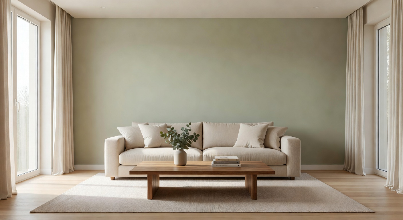
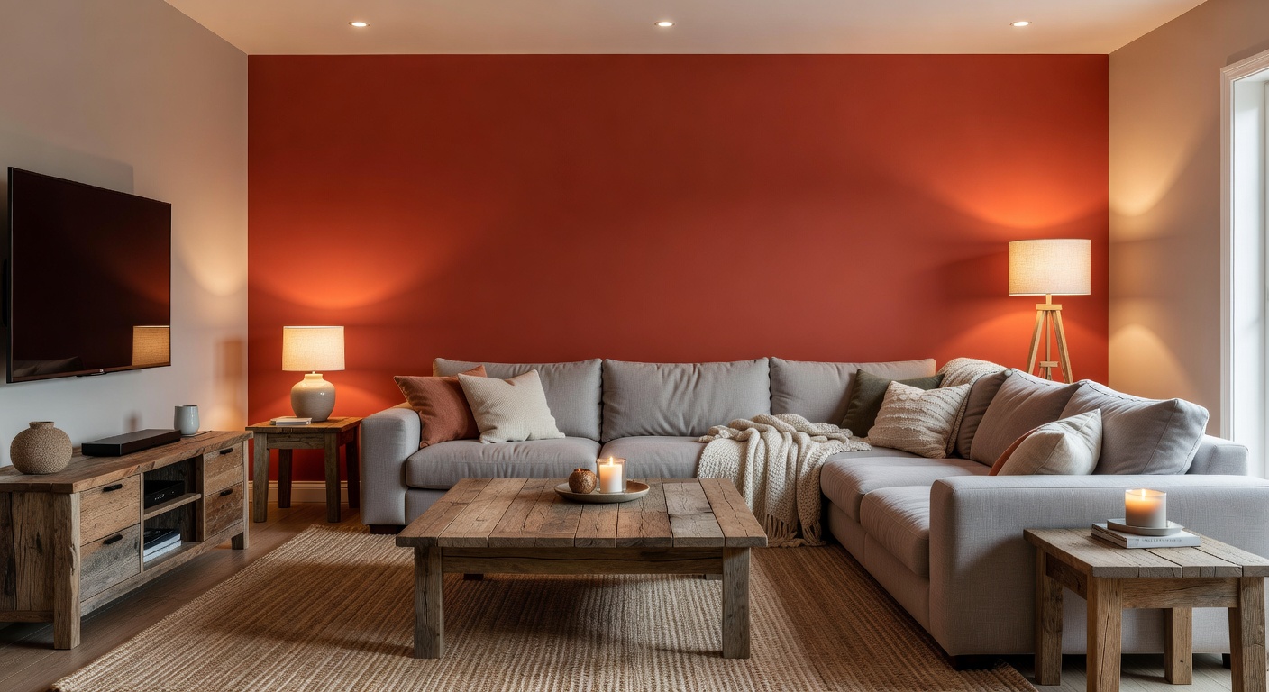
Warm Versus Cool Palettes and Their Psychological Effects
Warm colors like reds, oranges, and yellows stimulate energy and conversation, making them ideal for social living rooms. Cool tones such as blues, greens, and purples promote calm and relaxation, suiting spaces used for unwinding after work. Research from American Psychological Association shows that cool colors can lower perceived room temperature and heart rate, while warm hues may increase appetite and alertness. Balance is key—too much warmth can feel chaotic in smaller rooms. In practice, warm palettes encourage longer conversations and can make guests feel more welcome during evening events. Cool palettes help reduce visual clutter and create a serene backdrop for reading or quiet family time. Consider seasonal shifts as well: warmer tones may suit winter months while cooler shades refresh summer spaces without major renovations.
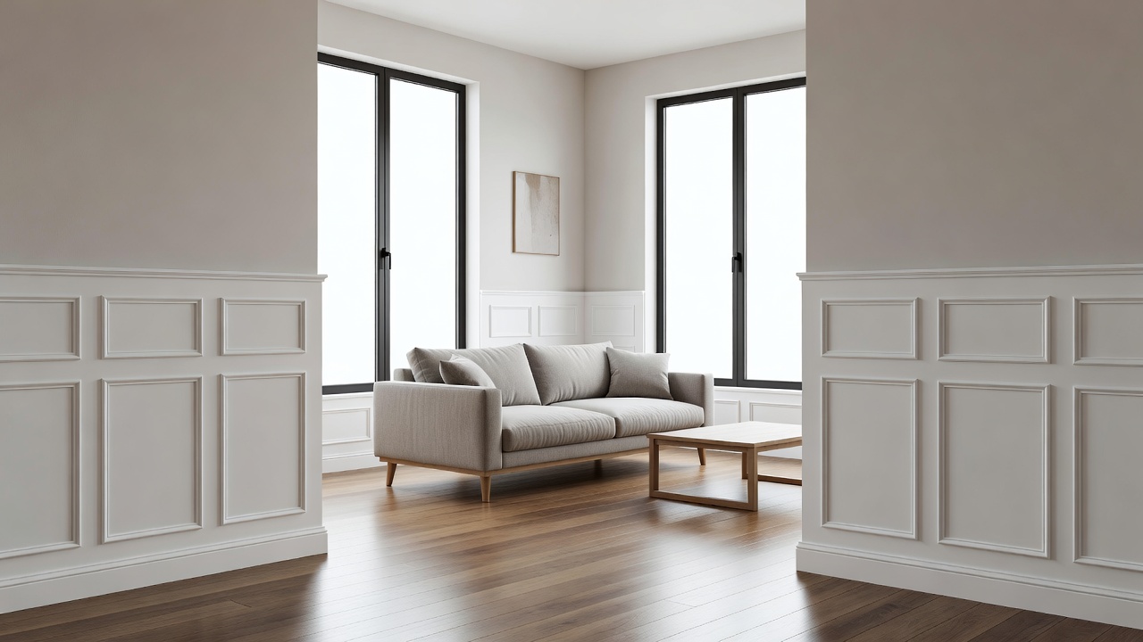
Selecting Hues That Complement Existing Home Decor
Start by auditing your current furniture, flooring, and artwork. Neutral backdrops like beige or gray allow bolder accents without clashing. If your sofa is deep navy, consider earthy terracotta pillows or sage green throws. Test samples against existing textiles under different lighting to avoid surprises after painting. Examine undertones carefully—some whites carry yellow hints while others lean blue, which can clash with wood finishes or metal hardware. Incorporate patterns from rugs or curtains as inspiration for secondary colors. This step ensures the new palette enhances rather than competes with beloved pieces you already own.
Step-by-Step Process for Testing Colors Before Remodeling
- Identify the room's primary function and natural light patterns throughout the day.
- Collect paint chips and large poster boards in candidate colors from multiple brands.
- Paint test swatches on multiple walls and observe them morning, afternoon, and evening.
- Live with the samples for at least one week, noting emotional responses from all household members.
- Consult family members or roommates for collective feedback before committing to full coverage.
- Photograph the swatches at different times to review later under consistent conditions.
This methodical approach prevents costly repaints and ensures long-term satisfaction. Many people skip the week-long observation period and later regret their haste when the color feels different in daily use.
Real-World Examples Across Various Room Sizes
In compact urban apartments, soft cool grays paired with white trim create an airy illusion that makes the space feel larger. Medium-sized suburban living rooms benefit from warm taupe walls with navy accents for depth and sophistication. Larger open-plan spaces can handle richer jewel tones on feature walls while keeping the majority neutral to avoid visual fatigue. For example, a 12-by-14-foot room might use a single accent wall in muted teal to define a seating area without shrinking the overall feel. In contrast, a spacious 20-by-25-foot great room allows for layered neutrals with bold orange side chairs that energize family game nights. These examples demonstrate how scale influences color intensity choices and help readers visualize applications in their own homes.
Accent Versus Neutral Schemes: A Comparison
Neutral schemes using whites, beiges, and soft grays offer timeless versatility and make resale easier. Accent schemes introduce personality through saturated colors on one or two walls. A hybrid approach—mostly neutral with strategic accent pieces—often delivers the best of both worlds for families seeking flexibility. Pros of neutral schemes include easier coordination with changing furniture and broader appeal to potential buyers. Cons involve potential blandness if texture and pattern are neglected. Accent schemes excel at creating focal points but require careful editing so the room does not feel disjointed. Consider your lifestyle: frequent entertainers may prefer versatile neutrals while creative individuals often enjoy bolder accents that reflect personal style.
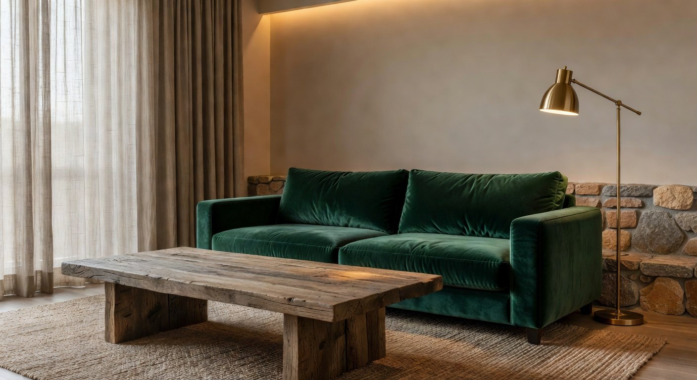
Practical Tips for Pairing Colors with Furniture
- Match wood tones to warm undertones in wall paint for cohesion across the space.
- Use metallic finishes like brass or chrome to bridge cool and warm elements seamlessly.
- Layer textures such as velvet or linen in complementary shades to add interest without new paint.
- Consider seasonal swaps: lighter textiles in summer and deeper hues in winter for variety.
- Position statement furniture pieces against walls that enhance their color rather than compete.
- Introduce greenery to soften transitions between contrasting hues and bring life into the room.
Lighting Considerations and Color Perception
Natural and artificial lighting dramatically alter how colors appear. North-facing rooms often need warmer paints to counteract cool daylight, while south-facing spaces can handle cooler tones. Test all samples with both daylight and evening lamps turned on. LED bulbs with different color temperatures (measured in Kelvin) further influence the final result, so bring home samples of your actual bulbs during the testing phase.
Common Mistakes to Avoid
Many homeowners rush into trendy colors without considering lighting or longevity. Another frequent error is ignoring ceiling color, which can make rooms feel shorter. Overusing high-saturation hues throughout an entire room often leads to visual overwhelm. Always preview colors on multiple surfaces and account for how fabrics and artwork will interact with the finished walls.
Frequently Asked Questions
How long should I live with test colors? At minimum one full week, including weekends when family routines differ. Can I use black in a living room? Yes, in moderation on an accent wall or through furniture for sophisticated drama. What if I rent and cannot paint? Removable wallpaper, large art canvases, or colorful textiles provide similar impact without permanent changes. Do colors affect resale value? Neutral palettes generally appeal to more buyers, but tasteful accents can still work if they feel current.
Conclusion
Thoughtful color selection transforms living rooms into spaces that support both relaxation and connection. By understanding psychological effects, following structured testing, and pairing hues thoughtfully with existing elements, you can achieve a design that feels personal and enduring for years to come.
No comments yet. Be the first!