 Fixated on Home
Introduction: Refreshing Your Living Room with Bold 2026 Paint Colors
Updating your living room with fresh paint is one of the most affordable ways to transform a space during a 2026 remodel. This beginner-friendly guide explores selecting and applying paint colors to refresh living room design and home decor. It covers trending palettes, the psychological impacts of hues, comparisons between finishes, and detailed step-by-step application techniques. Readers will discover real-room before-and-after transformations, a practical checklist for testing samples, advice on budget planning, and common mistakes to avoid. The article also includes an FAQ addressing durability and pairing colors with existing furniture. Homeowners seeking affordable, high-impact upgrades will find concrete advice to achieve professional results.
Trending Bold Palettes for 2026 Living Rooms
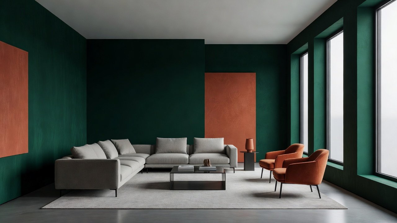
Design trends for 2026 emphasize rich, nature-inspired bold colors that bring warmth and personality to interiors. Popular palettes include deep emerald greens combined with terracotta and brass accents, moody navy blues balanced by warm neutrals and wood tones, and jewel-toned purples paired with soft golds or creams. These choices move away from muted grays toward expressive statements that still complement a wide range of furniture styles and architectural features. Earthy bold tones such as olive, rust, and mustard work particularly well in open-concept homes by visually defining the living area. In smaller rooms, jewel tones create drama when applied to a single accent wall rather than all surfaces. Many designers are also incorporating unexpected pairings like charcoal with sage green for a sophisticated layered effect that feels current yet timeless.
The Psychological Impact of Color Choices
Color significantly influences mood and how people experience a living room. Warm bold hues such as terracotta and deep coral promote energy, conversation, and social interaction, making them excellent for family gathering spaces. Cooler bold tones like deep teal or navy encourage calm and relaxation, suiting rooms used primarily for evening unwinding or reading. Saturated colors can make large rooms feel more intimate and cozy, while lighter bold shades help smaller spaces appear more expansive. Lighting plays a major role in how these effects manifest; natural daylight can intensify or soften a hue, while artificial lighting may shift its temperature. Testing samples under multiple lighting conditions helps homeowners select colors that support their daily routines and desired atmosphere.
Comparing Matte, Satin, and High-Gloss Finishes
Finish choice affects both visual appeal and long-term performance. Matte finishes deliver a soft, velvety appearance that hides minor wall imperfections and suits bold colors on feature walls, though they offer lower durability and can be harder to clean. Satin finishes provide a gentle sheen that resists moisture and scuffs, making them versatile for main walls, trim, and high-traffic zones while maintaining elegance. High-gloss finishes create a dramatic, reflective surface that highlights architectural details and is easiest to wipe clean, yet they accentuate every surface flaw and are best reserved for doors, trim, or ceilings. Many 2026 remodel projects combine finishes for added interest, such as matte bold walls paired with satin trim or high-gloss accents on built-ins.
Understanding Undertones and Lighting Effects
Every bold paint color contains subtle undertones that become apparent once applied. For example, a deep teal may lean green or blue depending on surrounding elements. Evaluating samples against existing flooring, furniture, and textiles reveals whether undertones clash or harmonize. Natural light from windows shifts throughout the day, while LED bulbs can cast warm or cool casts. Painting large test patches and observing them over several days ensures the final result aligns with expectations rather than surprising homeowners after full application.
Step-by-Step Application Techniques for Bold Colors
Successful painting begins with thorough preparation. Clean walls to remove dust and grease, repair cracks or holes with spackle, and sand smooth. Apply a quality primer suited to the surface and previous paint type, especially when covering light colors with bold new shades. Gather tools including angled brushes for cutting in, microfiber rollers for even coverage, painter’s tape, and drop cloths. Cut in edges first, then roll large areas in overlapping sections while maintaining a wet edge to prevent lap marks. Apply two thin coats rather than one heavy coat for richer, more uniform color. Allow full drying time between coats as specified by the manufacturer. Work in good ventilation and consider low-VOC formulas for healthier indoor environments during the remodel.
Real-Room Before-and-After Examples
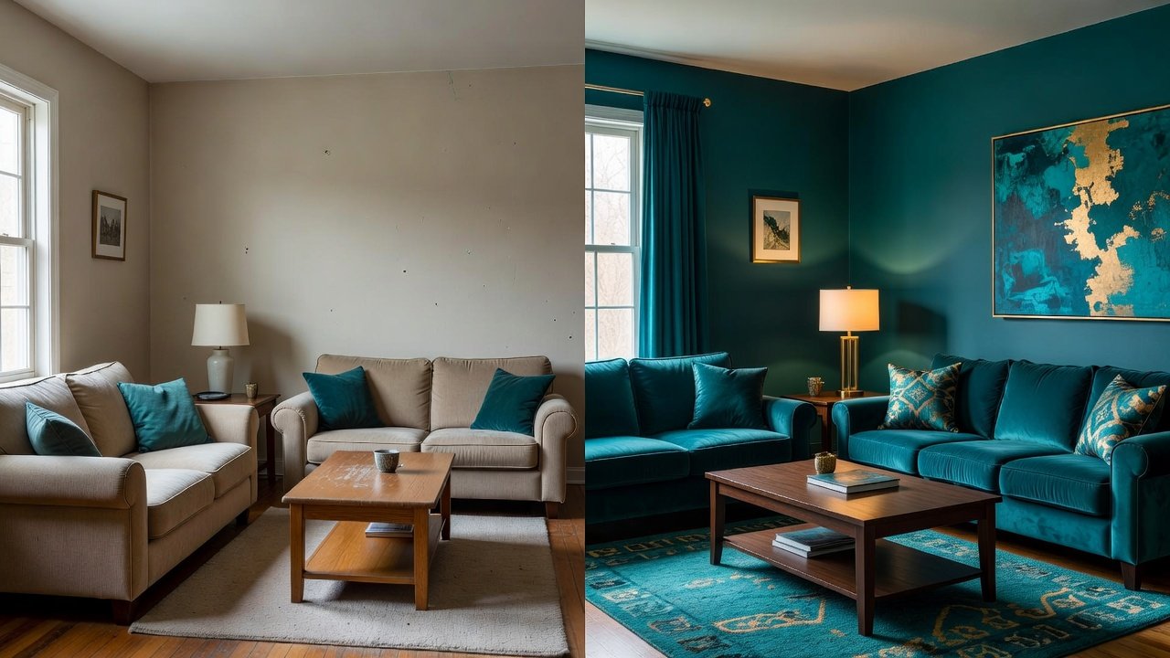
One suburban living room shifted from dated beige walls to a bold deep teal palette across three walls with a warm neutral accent. The transformation added immediate depth and made leather seating and wooden coffee tables appear more intentional and modern. Another example featured a neutral family room updated with warm terracotta on a single focal wall behind the television; this created visual interest that enhanced existing artwork and houseplants without clashing with wood flooring or upholstery. A third project transformed a compact urban apartment living area using jewel-toned purple on the ceiling and trim details, paired with matte sage walls, resulting in a cozy yet sophisticated space that felt larger due to strategic color placement.
Practical Checklist for Testing Paint Samples
Never commit to a bold color without real-world testing. Follow this expanded checklist: order large sample pots of two to three candidate shades; paint generous 2x2 foot swatches on multiple walls including both sunny and shaded areas; observe the colors at morning, afternoon, and evening under both natural and artificial light; compare samples directly next to furniture, textiles, and flooring; live with the patches for at least 48 hours to assess emotional response; photograph the samples for later review; and consult household members for additional perspectives before purchasing full gallons.
Common Mistakes to Avoid
Rushing color selection without adequate testing often leads to regret and extra coats later. Ignoring undertones can cause colors to clash with existing elements. Skipping primer on bold applications results in uneven coverage and wasted product. Failing to account for lighting changes throughout the day produces disappointing final results. Neglecting proper ventilation or using low-quality tools creates visible brush marks and odors. Overlooking future maintenance needs, such as durability in homes with children or pets, can shorten the lifespan of the new finish.
FAQ: Durability, Pairing, and Remodel Questions
How durable are bold paint colors in living rooms? Quality paints with good scrub resistance typically maintain appearance for five to seven years with routine cleaning and touch-ups as needed.
Can I pair bold walls with existing furniture? Yes—neutral accessories, complementary throw pillows, or area rugs help bridge old and new elements effectively.
What about VOC levels during application? Low-VOC and zero-VOC formulas minimize indoor air quality concerns; guidance is available at EPA.
How do I preview colors digitally? Online tools from Benjamin Moore and Sherwin-Williams allow virtual room visualization before purchasing.
Conclusion
Bold 2026 living room paint colors deliver high-impact results for remodel projects when homeowners approach selection and application thoughtfully. By exploring trending palettes, understanding color psychology and lighting, comparing finishes, following detailed techniques, and using structured checklists, anyone can achieve a refreshed space that feels current, cohesive, and personally satisfying. Begin with samples and a clear plan to enjoy lasting transformations that enhance both daily living and home value.
No comments yet. Be the first!